Color and Layout
Color Palettes
Within the FIT brand, there are three color palettes that can be used: the Official College Palette, the Spectrum Palette, and the Adaptive Palette. Each has a specific usage context.
Download complete and detailed Color Guidelines (.pdf)
New! We now offer an extended color palette for your designs.
Download the supplementary color palette (.pdf)
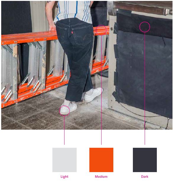
NOTE: The colors on this page and in the guidelines are examples. All color combinations must meet the contrast standards for accessibility.
Official College Palette
The school palette defines three key colors that should be used as the central colors. These new colors build on the tradition of the former FIT blue and move toward a more vibrant and expressive color range.
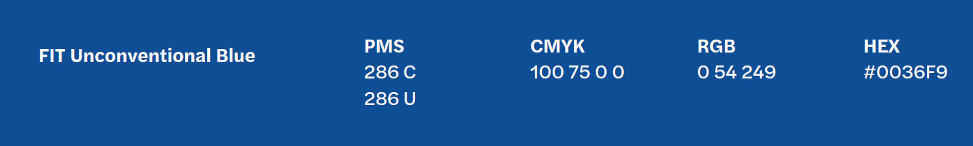
Primary/Blue
HEX: #0036F9
RGB: 0 54 249
CMYK: 100 75 0 0
PMS: 286 C and 286U
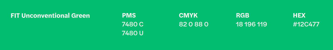
Primary/Green
HEX: #12C477
RGB: 18 196 119
CMYK: 82 0 88 0
PMS: 7480 C and 7480 U
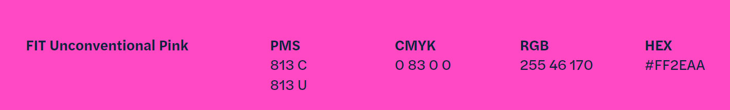
Primary/Pink
HEX: #FF2EAA
RGB: 255 46 170
CMYK: 0 83 0 0
PMS: 813 C and 813 U
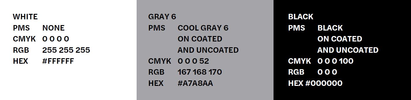
Primary
White
HEX #FFFFFF
RGB: 255 255 255
CMYK: 0000
PMS: None
Gray 6
HEX: #A7A8AA
RGB: 167 168 170
CMYK: 0 0 0 52
PMS: Cool Gray 6 Coated and Uncoated
Black
HEX: #000000
RGB: 000
CMYK: 000 100
PMS: Black on Coated and Uncoated
Spectrum and Adaptive Palettes
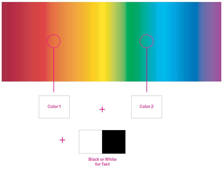
Spectrum Palette: Text-Only Application
The Spectrum Color Palette introduces a range of almost infinite color combinations to work for text only applications and layouts.
Given the broad options available through this palette, it is important to follow the guidelines closely in order to ensure legibility and visual consistency is achieved.
Adaptive Palette: Use with Images and Text
Unlike the Spectrum Color Palette, the Adaptive Color Palette works only when images are used in layouts and allows for a wider variety of color choices.
Graphic Treatments and Layout
Refer to these guidelines for expressive graphic treatments of how to use the FIT button and for examples when creating layouts for college communications.
Download complete and detailed Graphic Treatment and Layout Guidelines (pdf.)
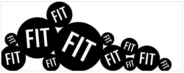
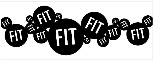
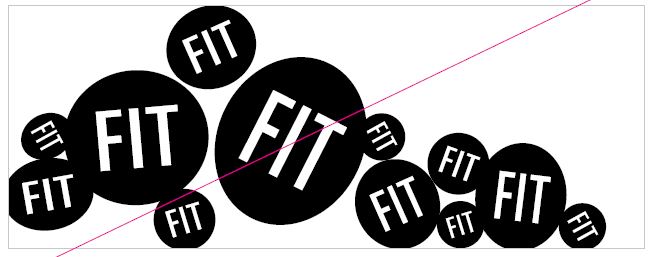
FIT Button: Graphic Treatment Dos
Create layouts that are adaptive to horizontal and vertical spaces without distorting the button symbol. Though the buttons touch, they should not overlap.
Example 1:
Example 2:
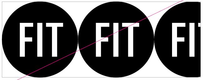
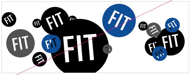
FIT Button: Graphic Treatment Don'ts
Always treat the button with care. Be mindful to not crop, distort, or severely overlap the button as dilutes the impact of this very important and iconic symbol. Finding the appropriate design balance is the key to a successful execution.
Example 1:
Example 2:
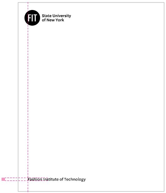
Brand Wordmark and Full School Name
The college’s full name, Fashion Institute of Technology, can be used when necessary, but it should always be in its own space and never be locked up with the master brand wordmark.
The cap-height of Fashion Institute of Technology should match the cap height from the master brand wordmark. If placed underneath the master brand wordmark, as shown below, the Fashion Institute of Technology should always left align to the FIT letters within the button.
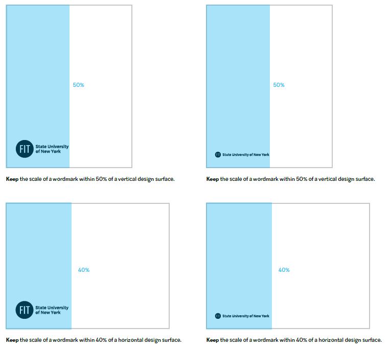
Brand Wordmark Lock-up Scale
A wordmark should never be scaled so that it is larger than the type size of the primary content. It should be considered an important but supportive element in any communication piece.
For most scenarios, the preference is to use the two-line master brand wordmark lock-up. However, if space is a major constraint, the single-line lock-up can be swapped in while still maintaining the ratios shown below.